Monday, September 28, 2009

The Soap Factory

This week's visit takes us to the St. Anthony Main area of Minneapolis, near the St. Anthony Falls, named by Father Hennepin after his patron saint (see artistic depiction of the event below in my entry for the Capitol), and former location of the once-glorious milling industry, which has left us gifts such as the Stone Arch Bridge and the Mill City Ruins (beautiful to visit after dark on a summer night). Many of these relics of industry have been repurposed, including the fantastic building now know as the Soap Factory.

The Soap Factory building began its life as a part of the railway and milling industry, but changed hands as industry declined and has spent most of its time as.....(surprise!) a soap factory. As that business moved on after decades, the space was abandoned for many years and fell into disrepair, before a chance meeting with a member of what was then called “No Name” studios led to the building becoming the alternative gallery space it is today.

No Name studios had thrived in the Warehouse district of Downtown Minneapolis long before it made its way to becoming the Soap Factory. A studio and alternative galley all on its own, it was completely run by artists and volunteers, unencumbered by the rigidity of commercial and conventional spaces, and free to be guided by the art, not vice versa.


The space itself took quite a lot of work and creative pursuit of funding to become what it is today, and is still able to hold true to its vision.

Most of the work shown at the Soap Factory is installation and conceptual art, which to me has a very strong impact and can be quite stunning. The Soap Factory has a binder full of artist's statements, so you can be informed as to their concept being represented. There were many fantastic pieces sharing the space.


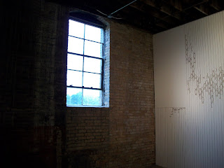
One of the pieces that I really appreciated wasn't the most obvious, but I felt drawn to it, in part due to the concept and idea from the artist. It is by Alison Owen, and is a wallpaper-type piece that fills one wall, with bits and pieces found in patches on other walls and the floor. It's a lovely design, and what first appears to be a muted gold color is revealed as something else entirely upon close inspection. Hair, lint, slivers of wood, flecks of dust – debris, from the gallery itself, is the material this lovely design is constructed from. It is quite a juxtaposition, which is part of the artist's intent. In her statement, Owen describes her work as parasitic and passive-aggressive, in that it appears to be docile and soft, but takes from the space to add to itself, and slowly installs itself as a force of its own, quietly informing the nature of the space. In a way, Owen's piece involves beauty and ugliness in a symbiotic relationship.

The other work that really struck me was a surprise sleeper hit. It wasn't the most complex or intricately constructed, but it inspired in me such pure wonder and joy that I would be doing a disservice if I do not feature it here.

The work is “Wireframe,” by Scott Rogers. Hidden behind a double blackout curtain behind a mural work (aren't the best things always found that way?), I entered a large room filled with bright light, emanating from boxes pointing in every direction of the room, and I could make out some tape used as trim detail around the room.

I liked the light boxes, and just as I was turning to leave......SNAP! They went out, and I found myself in a different room altogether.

The room was pitch black, but lit by the glow of the photoluminescent tape that ran along the edges of every architectural detail of the room. I was awestruck. I was giddy! It was like existing in a photo negative. Everything was simplified, but any detail that the room had was suddenly more present and important than it had ever been.

I scampered excitedly about the room, taking it all in as much as I could before the lights came on again and it was ripped away from me.

I had the wonder of someone seeing the world inside-out, the excitement of a kid with a friend and a flashlight in a blanket fort, where only the dewy face of the one telling the story is illuminated.

In his statement, Rogers talks about wanting to bring attention to architectural details of a space that might otherwise go unnoticed, and to do this yet stiff affect the space as minimally as possible. He also discusses how this piece has a visual effect similar to very early computer representations of reality, such as TRON. I must say, it really is like being in a virtual room from back when computer screens came only in black and green. Lastly, Rogers touches upon how the change the piece undergoes when the lighting goes off can underscore a change within those viewing the work and their own self perception. I know this is true for me – when I first entered the room, I was content to hang back and look at a distance, separate from the work, but once it changed, I wanted to be in the room, looking at it from every perspective and angle possible, not just close to it but part of it.


Also amazing:


Brett Smith's “Barricade”

Wendy DesChene's “PinkHorn DuckFeet – Generation 9”

Lauren Herzak-Bauman's “Memory Eternal”

Adam Parker-Smith's “Umbrella Cloud”

Eileen Maxson's video work, “Cinderella+++” was beautifully constructed, hilarious, and awesome.


As to the Soap Factory itself, I thought the gallery was perfect and incredible. The character of the structure lends itself well to free flowing, boundless creative expression, and the very rawness of the space allows you to experience the art in a more visceral way, to feel free to be physically and emotionally engaged in the work, to let yourself go past mere observation. It also has some beautiful details of its own.


But then, I do love old buildings.

Go visit the Soap Factory! Or at the very least, go play in the dark!

-Catherine


Sunday, September 20, 2009

the Minnesota Center for Book Arts and the Rosalux Gallery

Dear readers,

I must begin this week's blog entry with a disclaimer. My writing today is brought to you in the midst of a bout of the dreaded Swine Flu (which I've been referring to as the Bacon Flu), and so may not be as clear or cogent as possible. However, we must soldier on...


This week, we traversed to Downtown Minneapolis to explore the two galleries housed in the Open Book Building/Complex: the Minnesota Center for Book Arts, and the Rosalux Gallery. Though I have known of Open Book through writers I have known who take advantage of their workshops and printing/publishing facilities, I had been unaware that it also houses two wonderful gallery spaces as well.

The current exhibition at the Minnesota Center for Book Arts is "NONE OF THE ABOVE: Assembling, Collaborating, and Publishing in the Eternal Network"

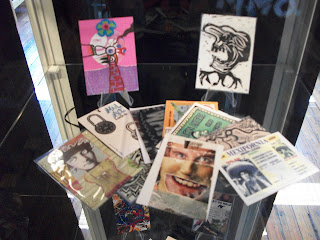
The pieces or publications are loosely based around a theme. A group of artists each submits work based on their take on that theme, which is gathered together without "editorial oversight", and assembled to become a greater piece of art. The result can be wonderfully eclectic.

This exhibition was laid out in an interesting way. Collaborative works were shown together, either in display cases or hung in clear plastic in a line.

I for one really appreciated this setup. It allowed for each collaborative piece to be seen as a separate and whole piece, and yet allowed for close inspection of each of the individual pieces of a work. It gave you a sense of the separate and group aspects of the art.

One of the greatest things I took away from this exhibition was the vast amount of different takes or viewpoints submitting artists had on a subject. Where one responded with a poem, another submitted folded paper art. It was inspiring to see all of the different and creative aspects separate people held in one subject. One of the groups I liked did contain a poem, two pieces of folded paper art, and a luggage tag with a print of the receipt for the trip on the top, among many other pieces.

An Allen Ginsberg submission drew me in, as his work so often does.

Mostly, the pieces in this exhibition were on the small scale, which is understandable, considering that most of these collaborations have to be mailed in. I rather liked the sense of it - nothing gigantic or overpowering, but artistry that had to fit into a small package and yet stand out and stand alone in its own right. I feel it made it easier (for me) to take in all the works on equal standing, and not have the brilliant-but-small overshadowed by the huge-and-attention-demanding.

The work took the form of a variety of mediums, most paper and ink based, some hand-drawn, some typed, I noticed a good amount that were the work of stamp or relief techniques, and others that had been produced by screenprinting. All printmaking processes are incredibly labor-intensive and show great dedication to artistic vision, if you ask me.

Some of my favorite collaborations were all wallet or palm sized, in a way...

Wipe, printed toilet paper bookwork, David Dellafiora, Australia

Bank of Fun, "designer currency", Vittore Baroni, Italy


Trade Off, artist trading cards, David Dellafiora,Australia

Also included: an art collaboration you can listen to!


And on the other side of the building...

The current exhibition at the Rosalux Gallery is "Praise and Punishment", featuring artwork by Toni Gallo and Joel Starkey. When I visited, the gallery was staffed by one of the artists.

In my sickly state, I had no cohesive thoughts to share with her.

The Rosalux Gallery is a bit more of a traditional gallery setting, with artwork hung on the walls and under spot lighting, though not entirely. A few of the pieces were more three-dimensional, spilling out from the wall and encroaching upon the space of reality.

This has a very dramatic effect, and brings to mind a feeling that the work is reacing out to you in some way.

However, the more traditional paintings hung on walls is also appreciated in that it gives you distance and separation to take in the work on your own terms.

Toni Gallo's work was of a more traditional medium, though felt very modern in the characters and emotions they embodied. The title of the exhibition came from the name of one of her pieces, "Praise and Punishment".

Joel Starkey's medium was mostly comprised of black-and-white drawings and cassette tape, sometimes combined.
One of his pieces that I found compelling was a simple drawing titled "Ol' Dead-Eyes"

I connect with what I see in this drawing - a person in a completely, wretchedly exhausted emotional state, who has been put through the ringer so much so that there is not much left but to look on the world with dead eyes. My recent personal life can commiserate.


The other work that struck me was also by Starkey, titled "The cabin in the woods..." and is a three-dimensional piece made entirely of cassette tape and commanding an entire back room of the gallery space.

I don't know how it is that I can say that cassette tape is an emotional medium, but it really is. It ebbs and flows, it runs straight and pools in curls, it is orderly or a mess of tangles, and I think this piece showcases its versatility. It also brings to mind the impressions one would get from being present at the site of a cabin in the woods: the organic, tumbling, bounding and boundary-less underbrush and shrubs, trees and foilage, and in their midst, the starkly straight and uniform lines of man-made shelter, the cabin. A juxtaposition, perfectly emoted in cassette tape.


Also included (hidden away in the lowest depths of the gallery): the work of Asia Ward, solar powered mutant stuffed animal sculptures!
Now, that's what I call AWESOME SAUCE!

I would recommend two things to you, dear readers: visit these galleries, and stay healthy and far away from the ravages of this Bacon(Swine) Flu.

Sunday, September 13, 2009

The Minnesota State Capitol

For our second excursion, we ventured a very short distance to the Minnesota State Capitol building, located in downtown St. Paul. As I was told by both my instructor and the tour guide, our state capitol building has the distinction of being one of the greatest, most beautiful, most impressive capitol buildings in the country. It's not hard to see why.

The building was designed by local Cass Gilbert, who went on to design other state capitols and such buildings as the United States Supreme Court building. He was not only the architect, but also had a main role in the interior art and decoration as well. Gilbert designed the building in the “Beaux-Arts” style that was popular at the time, and common among governmental buildings around the US. The Beaux-Arts style could be described as a more modern, American twist on classical European architecture. The building was completed in 1905, less than 50 years after Minnesota achieved statehood, and the goal was to build a capitol building that would showcase Minnesota's movement from a wilderness-filled territory to that of a civilized, sophisticated, important, and perhaps somewhat cosmopolitan locale. The fruit of that endeavor stands proudly before us, embodied in marble and granite.


Upon actually entering the capitol, one is drawn into the Rotunda in the center of the building. The floor of this circular area is inlaid with tile, glass, and brass, the latter used in a giant representation of the symbol of L'etoile du Nord, the North Star State.


This theme is repeated in decorative paint throughout the building.


Looking up, the Rotunda area soars above hundreds of feet to the inside of the dome. It is a space designed, it seems, to inspire awe and wonder, and to impress upon visitors the extensiveness of its beauty.

Wrought metal balconies look over the area from the second level, and four murals are found in panels on the inside of the dome.


These centrally placed murals by Edward Emerson Simmons depict the theme of “The Civilization of the Northwest,” with sub-themes such as wilderness, discovery, and agriculture. Having these themes presented in a classical way was purposeful, perhaps to frame the more recent history of the state in a classical and “civilized” context.

Honestly, the entire building is filled with art, murals, statues, quotes, and decorative elements, every piece conveying an idea or message of some kind. Almost every square inch is deliberately intended in a way, which is interesting to tour but can be overwhelming if you ruminate on it a bit too much


However, two styles of art are most prominent – realism and allegory. One of the best Realist pieces is found in the ornately decorated Governor's Reception Room, and is also a common sight for a lifelong resident of Minnesota, though I had never known the original was housed here.

It depicts Father Hennepin blessing the St. Anthony Falls, along with a group of Native Americans peacefully accompanying him. I've always liked the painting for the peace, harmony, and quiet it seems to depict among the two disparate peoples present, and also because I enjoy comparing that scene to the present site of the St. Anthony Falls.


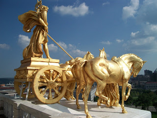
Allegory is the other type of art found in the capitol. Though at times I find this style a bit heavy-handed, it can be great when it is done well. My favorite piece is one that (I have discovered) many people do not realize is allegory, but rather simply the main decorative piece of the capitol: The Quadriga.

Though the horses and chariot are common in classical art, the Quadriga at the capitol embodies some rather interesting imagery. The four horses depict the forces of nature, with the women holding their bridles depicting the forces of civilization that harness the forces of nature: agriculture and industry. The person on the chariot, holding a sign with the word “Minnesota” on it, is the progress of the state, pulled by these forces. I for one thought it was some really fun and well-done allegory, in a sensible way.


I would write more, but shouldn't. I instead leave you with these pictures:

-Catherine